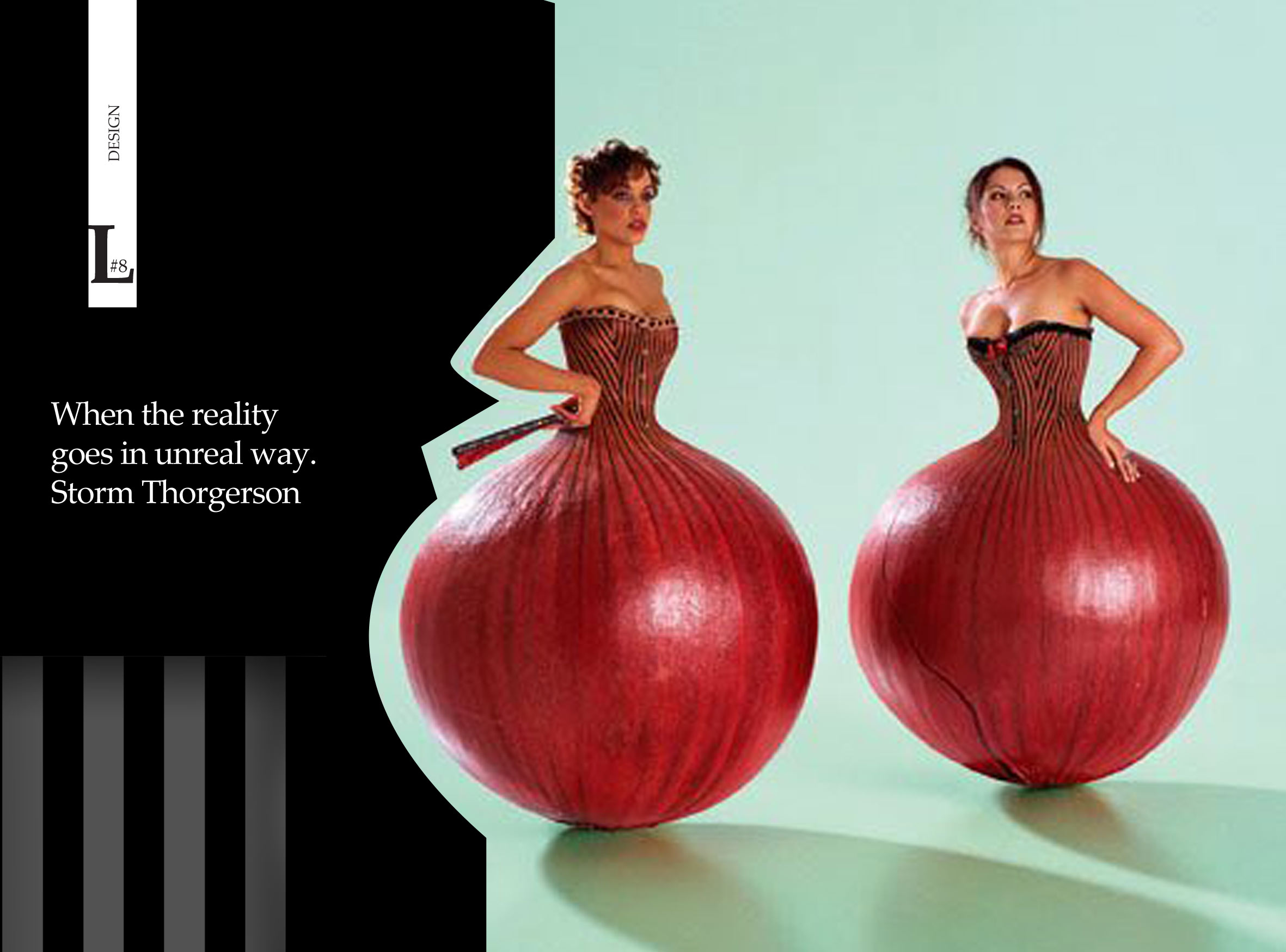
“I listen to the music, read the lyrics, speak to the musicians as much as possible. I see myself as a kind of translator … I like to explore ambiguity and contradiction, to be upsetting but gently so. I use real elements in unreal ways.”
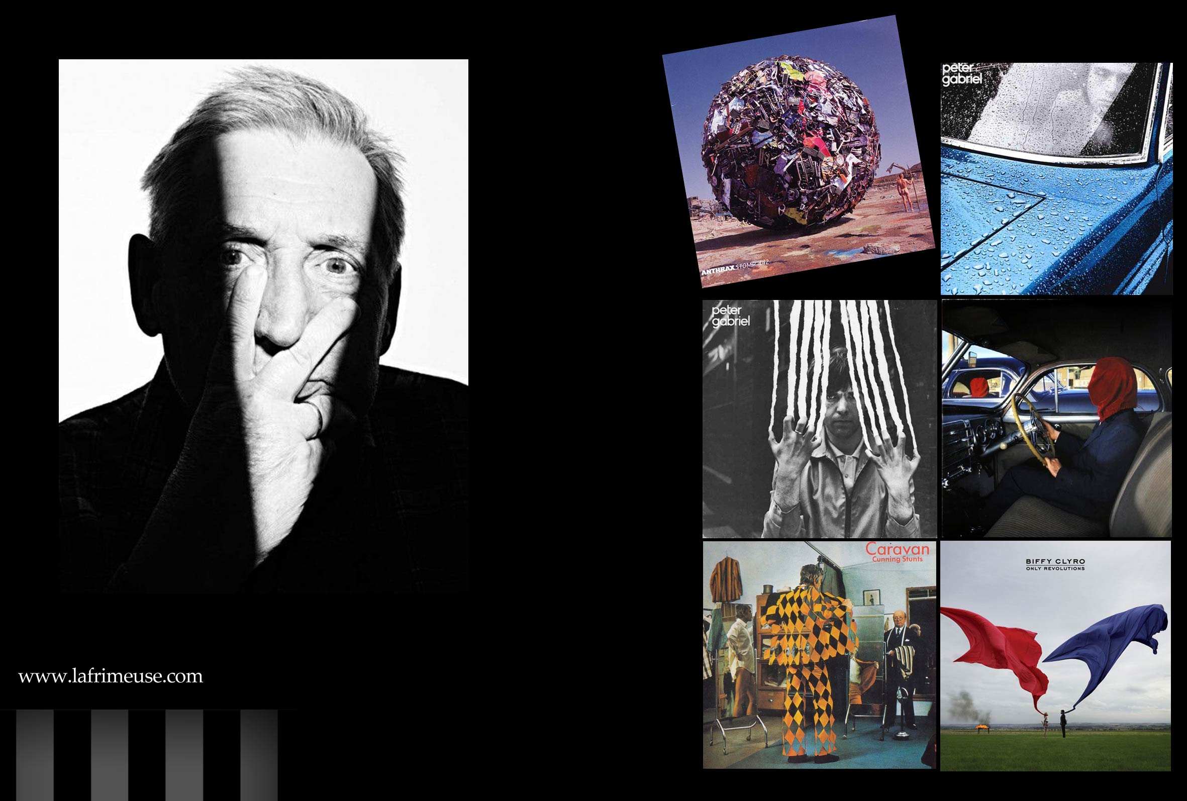
These words of Storm Elvin Thorgerson (28 February 1944 – 18 April 2013), an English graphic designer whose ideas have become iconic covers of the most famous rock musicians Pink Floyd, Led Zeppelin, Nik Kershaw, Black Sabbath, Scorpions, Peter Gabriel, Genesis, Yes, Al Stewart, Europe, Catherine Wheel, Bruce Dickinson, Dream Theater, Anthrax, The Cranberries, The Mars Volta, Muse, The Alan Parsons Project, Helloween, Biffy Clyro, Angels and Airwaves и Rival Sons.
His images or real, but placed in unrealistic conditions or his real situation is filled with unreal characters. Like the music that sets own images for every perso. Thorgerson began the career of the designer with the founding of his own studio with his classmate Aubrey Po Powell, born September 23, 1946, also in the future the famous designer and later director, producer and screenwriter.
Many unique covers were created in the studio Hipgnosis, which existed until 1983 . After his business partner created his production company, at the same time, Storm Thorgerson founded the Storm studio, in which a huge number of images for books and albums were made. The studio continues his work after the death of the designer in 2013.
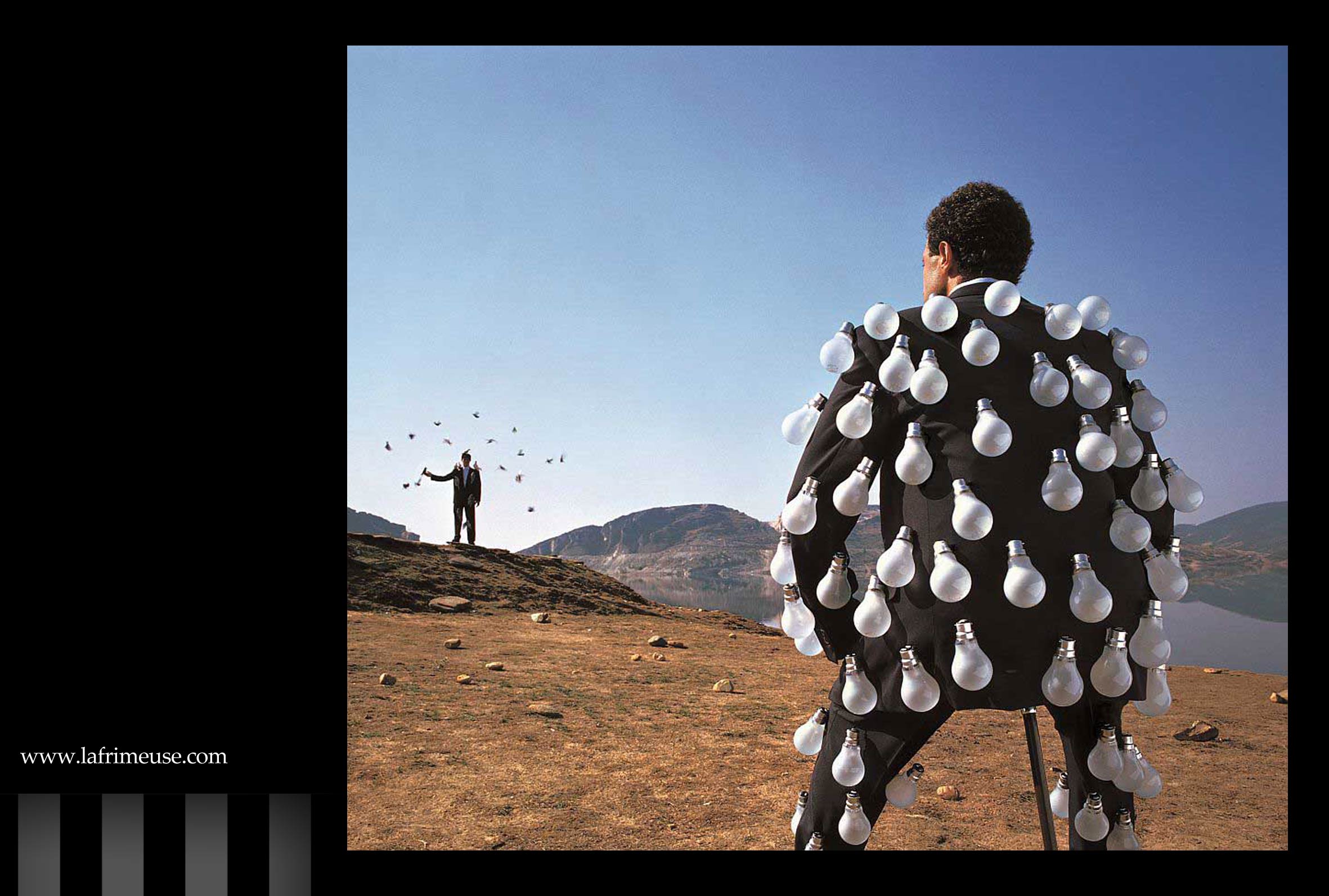
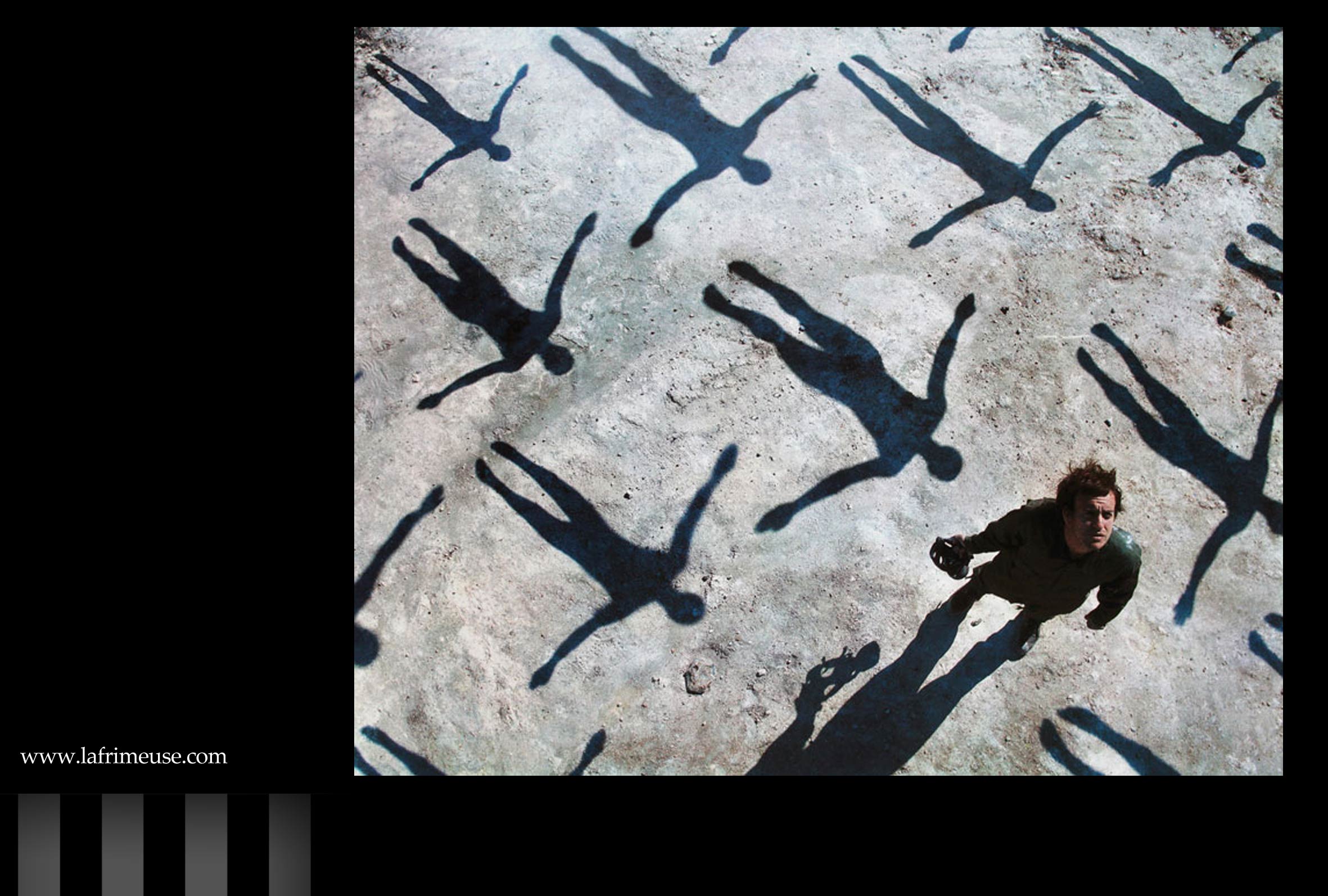
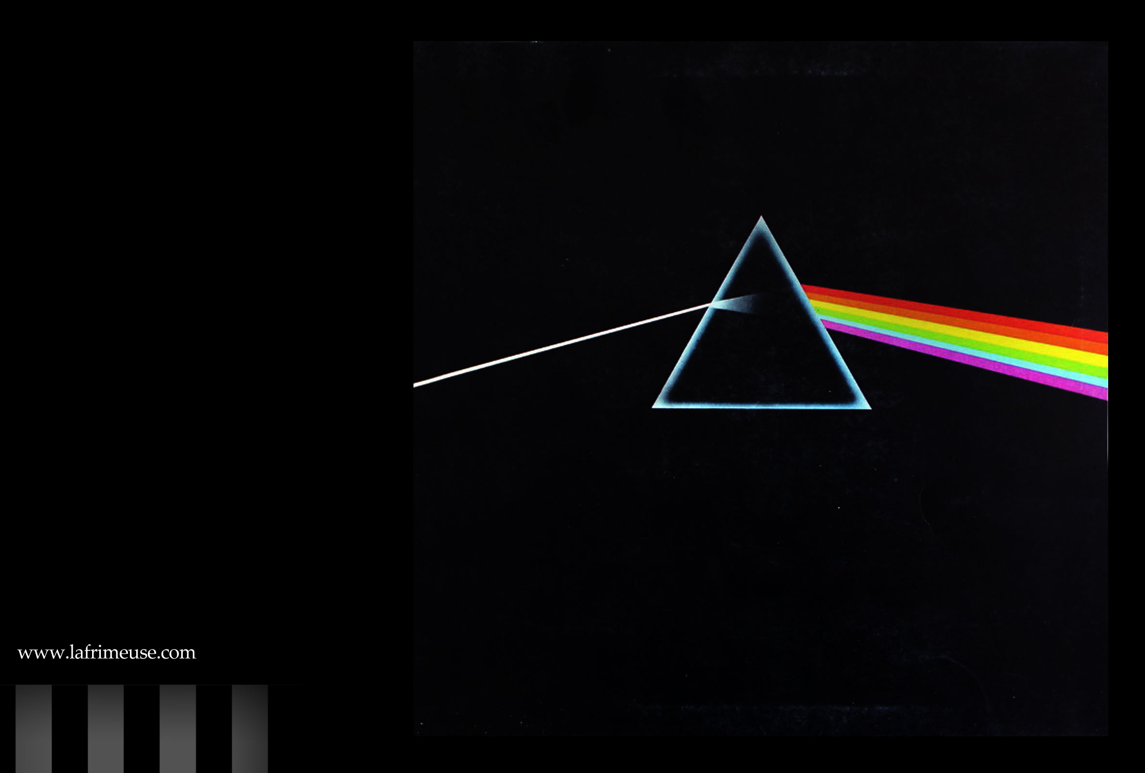
The Dark Side of the Moon is one of the greatest designed albums of all time, made by Thorgerson and his studio. Many of the designer’s works are known for surreal elements. He often put objects in an unexpected environment, far from their usual context, creating vast spaces around them, and the strange appearance of the characters there highlighted their beauty.
“I like photography because it is a reality medium, unlike drawing which is unreal. I like to mess with reality … to bend reality. Some of my works beg the question of is it real or not?
Thorgerson anticipated what was then possible to create in Photoshop, his collages are a unique world created by imagination inspired by music.
Here, in an interview from 2009, he talks about some of his creations
10cc – Look Here (1980)
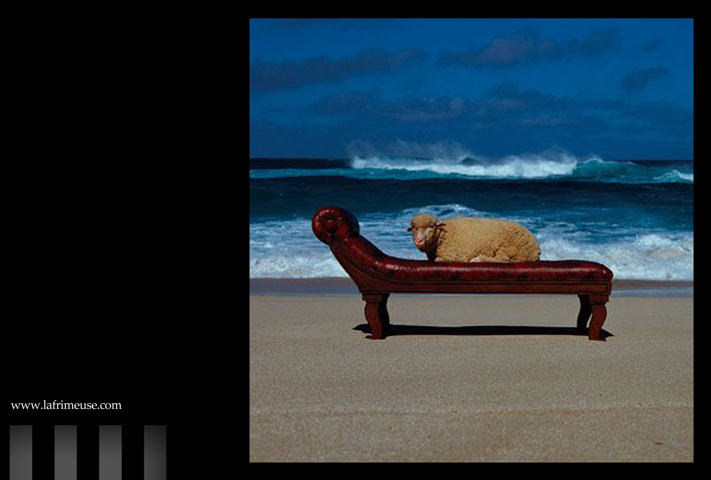
Storm: ‘This picture of a sheep on a psychoanalytic couch was designed as a poster insert for 10cc’s 1980 album, Look Here. The band asked for ‘something different’. I never really have a clear idea of what that expression means … I thought it was more engaging to ask a question and between us we came up with ‘are you normal?’ Anyway, the question led to the idea of normality and what could be more normal than a sheep, all of whom tend to follow each other. But to be normal you’d need a lengthy dose of psychotherapy.’
Alan Parsons – Try Anything Once (1993)
Storm: ‘The title suggested something a touch reckless, perhaps, or at least a departure from normal behaviour. We joined this thought with the image of a bungie jump from a high bridge on television – wondering what on earth people would do for a thrill.’
Black Sabbath – Technical Ecstasy (1976)
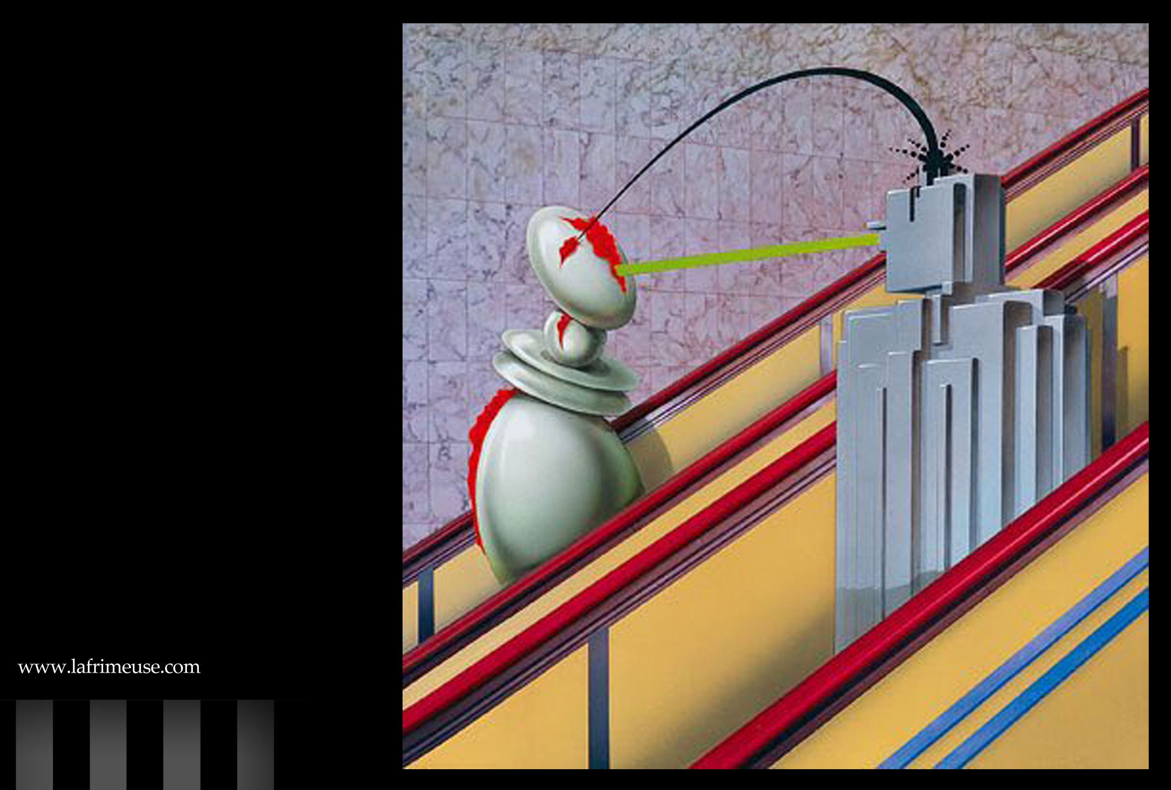
Storm: ‘Here is a design taken unequivocally from the title. I don’t think I heard the music, I’m sorry to confess, but the title was so evocative and promising that it wasn’t necessary.’
Deepest Blue – Late September (2004)
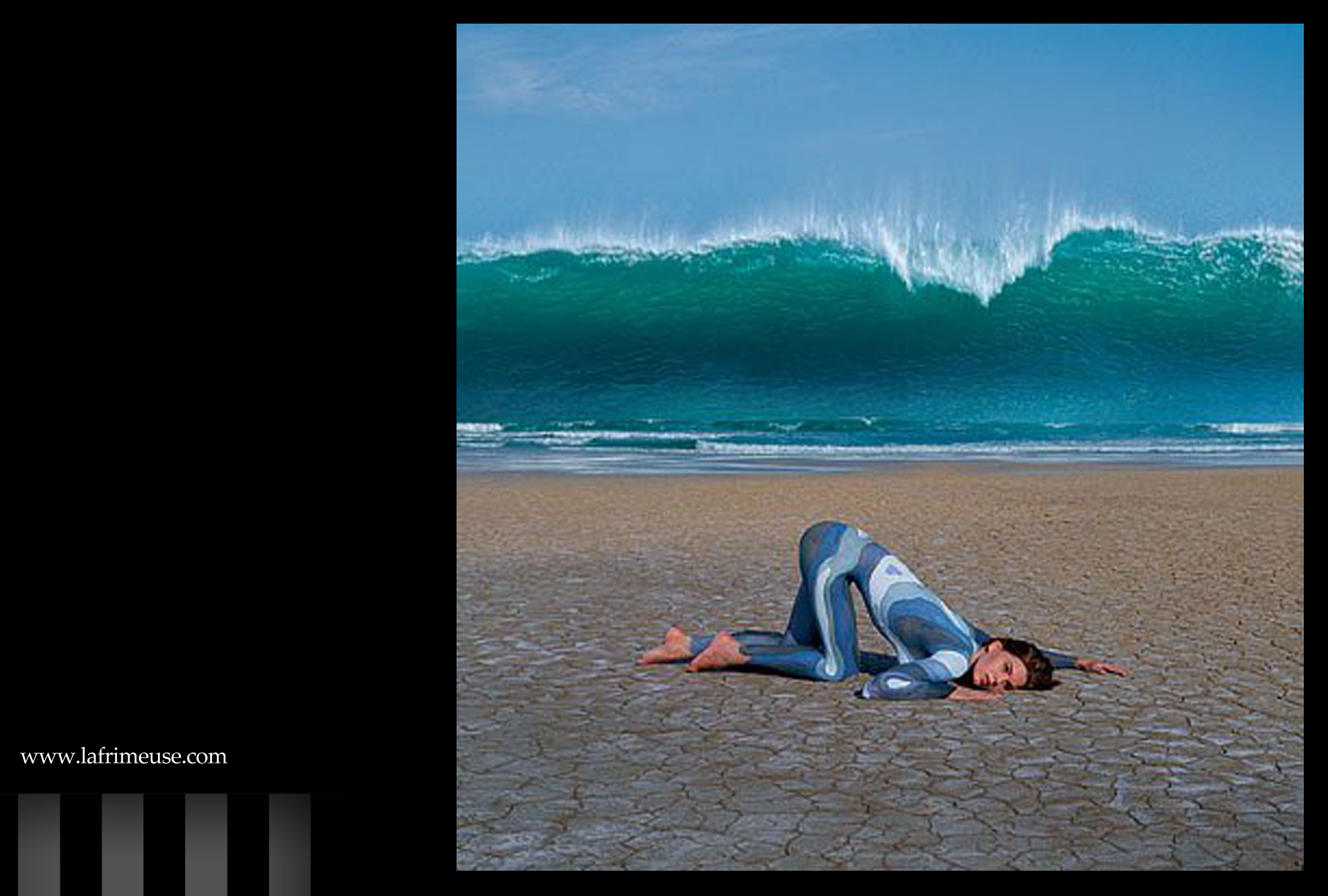
Storm: ‘The idea came from something about ‘keeping tabs’, keeping up with the news, finger on the pulse, having your ear to the ground. I had also wanted to use a very large wave or tsunami ever since Dark Side of the Moon.’
Ethnix – Thirteen (2001)
Storm: ‘Ethnix are from Israel and both the albums on which we worked seemed concerned with war, the first more directly so. It appeared that Ethnix were as questioning and critical of their own country as of others.’
Pink Floyd – Pulse (1995)
Storm: ‘Much as I’m fond of books and photo galleries, I regret that we cannot show you here the pulsing red light that was a feature of the package for Pink Floyd’s Pulse CD – a double live album of The Division Bell shows at Earls Court, London.’
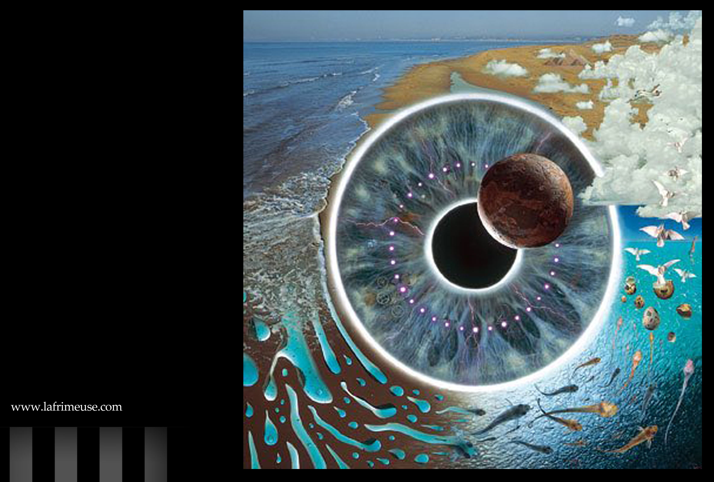
The Cranberries – Bury the Hatchet (1999)
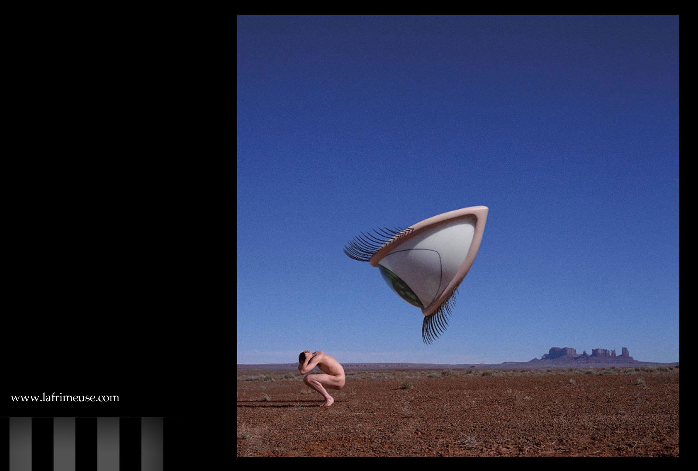
Storm: ‘I was both suprised and heartened that the Cranberries chose the design at all … the Cranberries had previously used pictures of themselves, often on a sofa. Our image was clearly a departure, not a sofa in sight. The second miracle arose after we decided that red earth was paramount to contrast with a blue sky, which had to be empty (ie cloudless, to echo the empty landscape and to emphasise that the All Seeing Eye can get you anywhere).’
Photographs: www.stormstudiosdesign.com
The interview entirely see here


